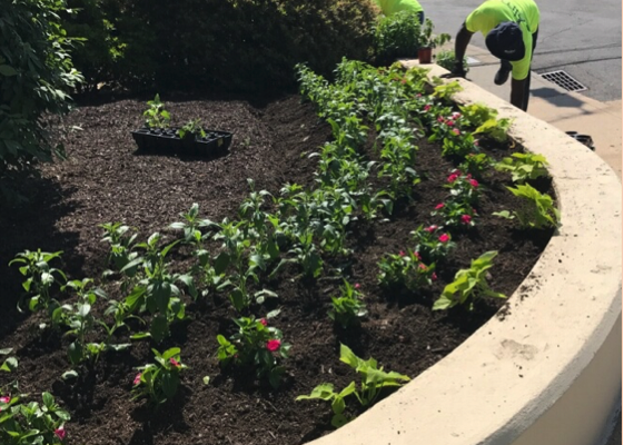
ELM’s color team knows that the impatiens, petunias, begonias, and the variegated coleus’ we choose for our customers’ color borders, entry walkways, signage, and other critical focal points are more important than just the bright pop of color they bring; they have meaning beyond their obvious impact.
In fact, research suggests that people feel colors more than they see them. This is why stylists, landscape professionals, garden designers, interior decorators, and real estate marketing experts use color to create different moods or to inspire, energize, or simply to make people happy.
ELM’s color team selects colors so that its collective effect makes small spaces seem larger, attracts attention to showcase areas, and creates a sense of flow.
ELM’s color strategy is generally based on installing warm hues, such as reds, yellows and oranges, front or center; cool colors and taller plant and foliage varieties in darker shades, such as blues and purples, behind; and tapering off into the background with supporting shades and texture to create an illusion of depth. We find that mass plantings of warm colors tend to make landscape areas feel more intimate and that staying within one color group tends to provide a sense of unity. For high impact, we recommend juxtaposing warm and cool colors to provide contrast, drama, and a sense of energy.
For information on seasonal color rotation or to learn how landscape color impacts the perception of your brand, contact professional horticulturist Bruce Moore, Jr., vice president, operations at 203-316-5433.